.png)
Connecting a Financial Management app’s features into a cohesive experience
Articulating why the current platform experience felt fragmented
To begin, our team conducted a platform audit to identify why it currently felt disjointed. It was found that the current information architecture of the app lacked a cohesive strategy that organizes the app’s various features. For instance, users could track their daily budgets, but it was unclear how this could impact the goals feature of the platform.
This finding was particularly prevalent in the main navigation and dashboard, which play vital roles in showing users how the platform is organized. We identified these areas as potential main focuses of design interventions moving forward.
To guide our efforts to redesign the IA, we would need to gain further insight into how users approach managing their finances, including any pain points that they experience in the process. For this, four interviews were conducted with potential users. The main findings were:
Insight 1: A main priority is personal budgeting, especially at times when unexpected financial expenses occur.
Insight 2: A primary long-term goal for many people is to increase savings to secure a solid financial future.
Insight 3: A main pain point is trying to gain an at-a-glance overview of their financial situation, as it often involves aggregating multiple information sources.
With these insights acting as our foundation, we began the IA redesign.
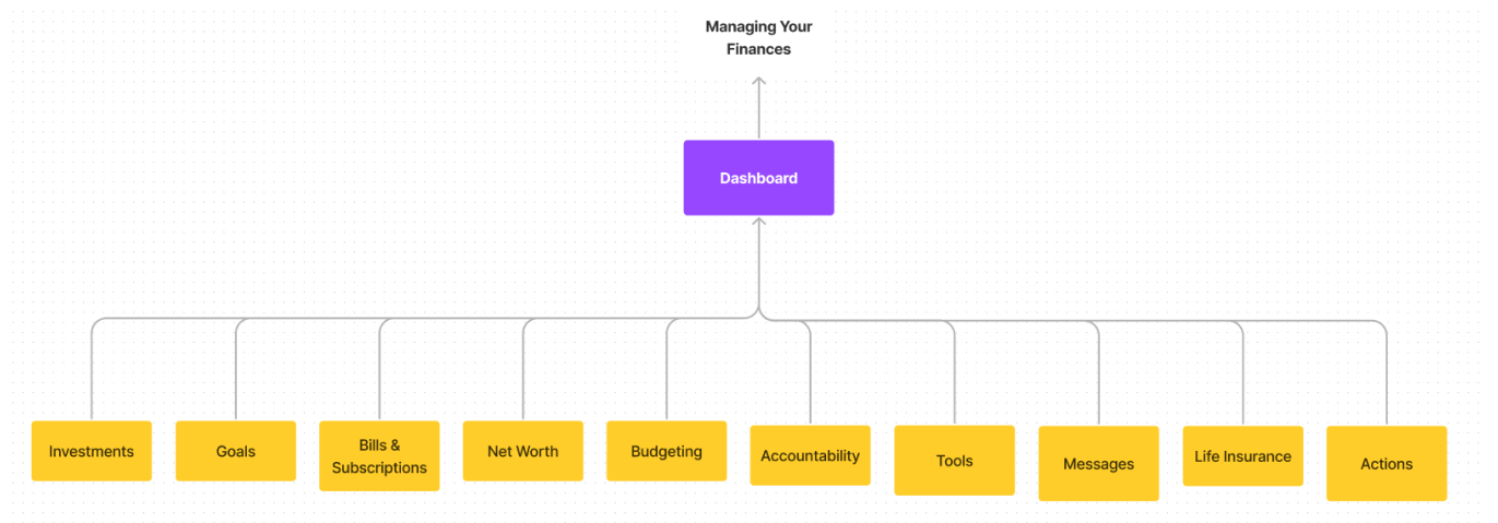
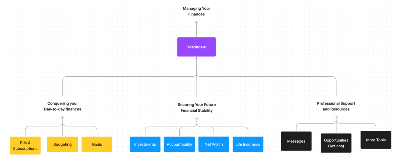
Defining the subcategories to increase cohesion between features
It was decided that introducing subcategories into the existing IA would help give the platform more cohesion. The research found that users often frame their finances in the short term (daily budgeting), and long term (saving and investing for retirement). Many respondents also sought professional advice to assist in all areas of their personal finances. As such, these facets would be used as the subcategories to group the platform’s various features.
With the new subcategories shown below, each feature would feel more closely related to each other, overall creating a more unified logic to tie the platform together.
Executing the new IA on the Navigation and Dashboard
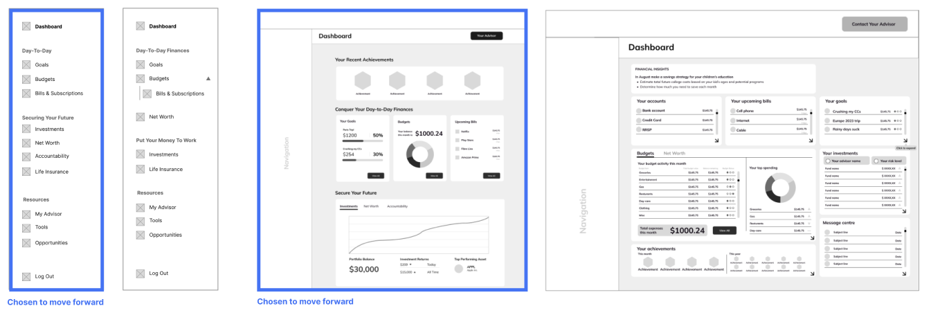
The next step in the process was to draft how the new IA would be expressed through the UI. As we had decided in our initial platform analysis, we focused our designs on the main navigation and dashboards. Initial iterations explored various strategies of regrouping the existing elements under the new subheadings.
Extending the IA Redesign onto the Feature Pages
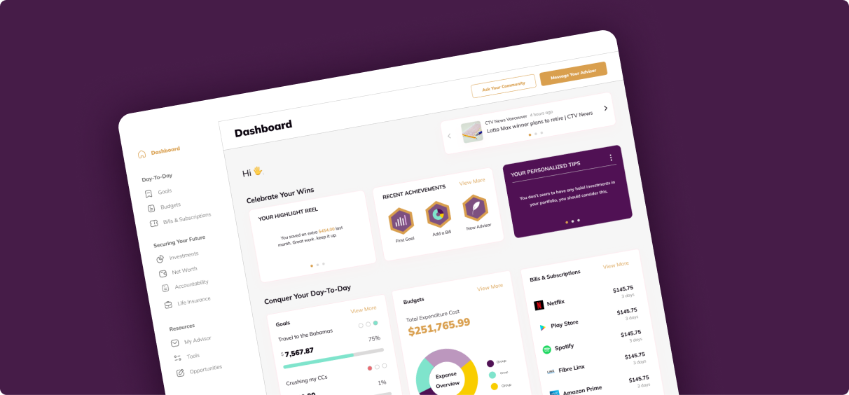
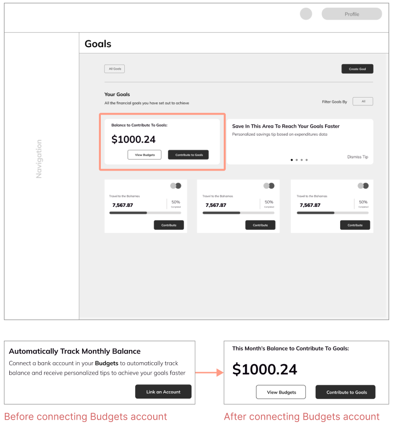
As a secondary goal, we explored whether the new subcategories provided us the opportunity to encourage users to engage with more of the platform. For this, we designed a system of Card UI that show the user how using others features of the platform can provide them additional value.
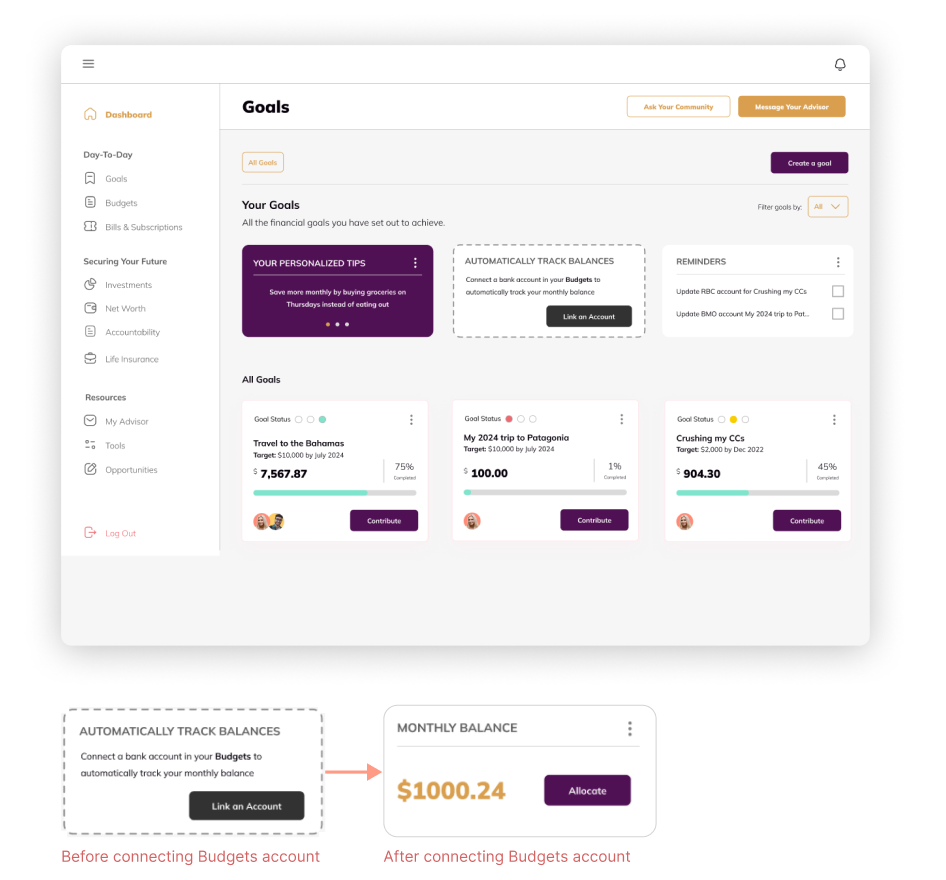
For example, shown below is the Goals Feature page. The Value Card here would encourage users to connect a Budgets account to get access to a monthly balance to allocate to their Goals, that has been automatically calculated from their expenses.
The main benefit of this design system is its modularity, allowing it to be applied flexibly across the platform while continuing the app’s existing visual language.
From here, our team implemented the new solutions into the platform's existing design system, providing 3 distinct design details to organize the changes for our client.
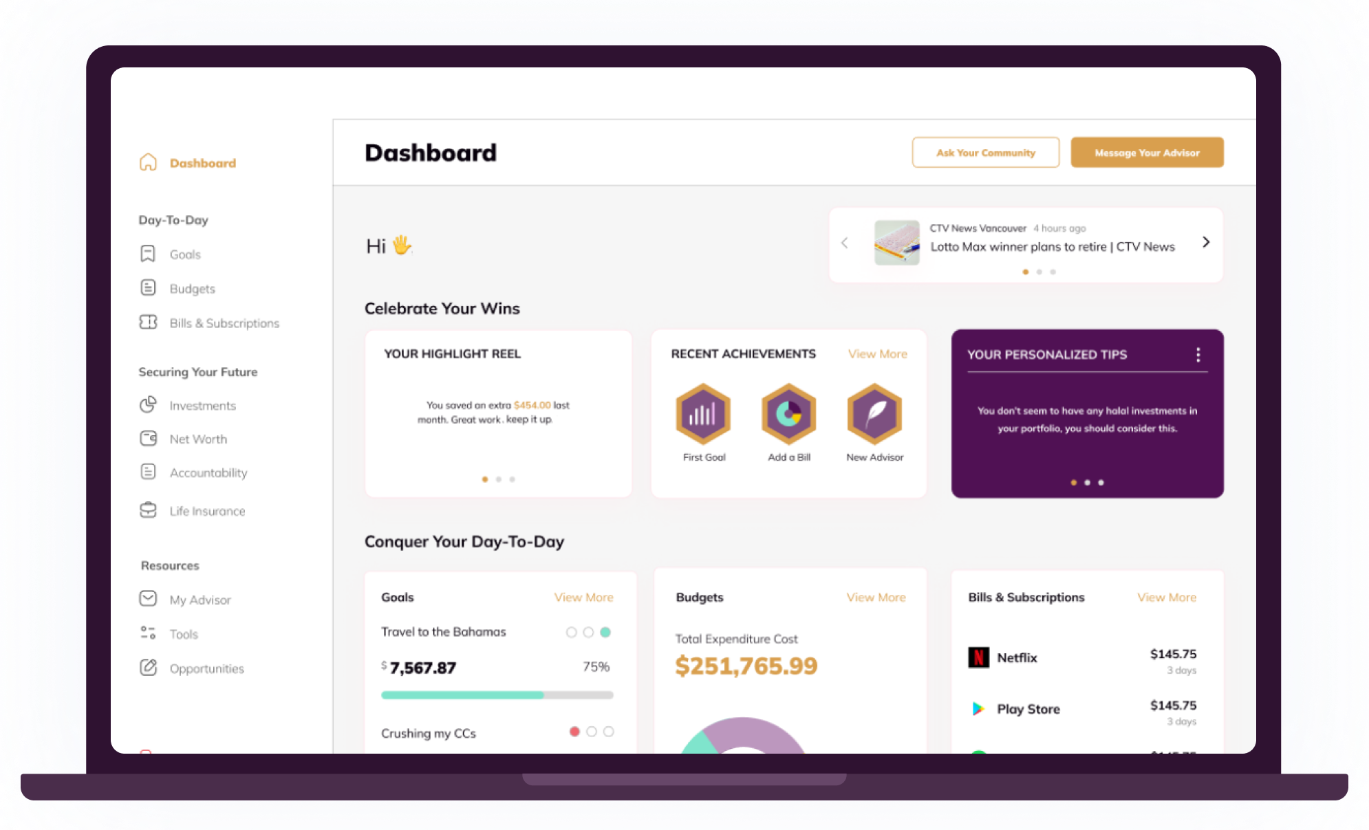
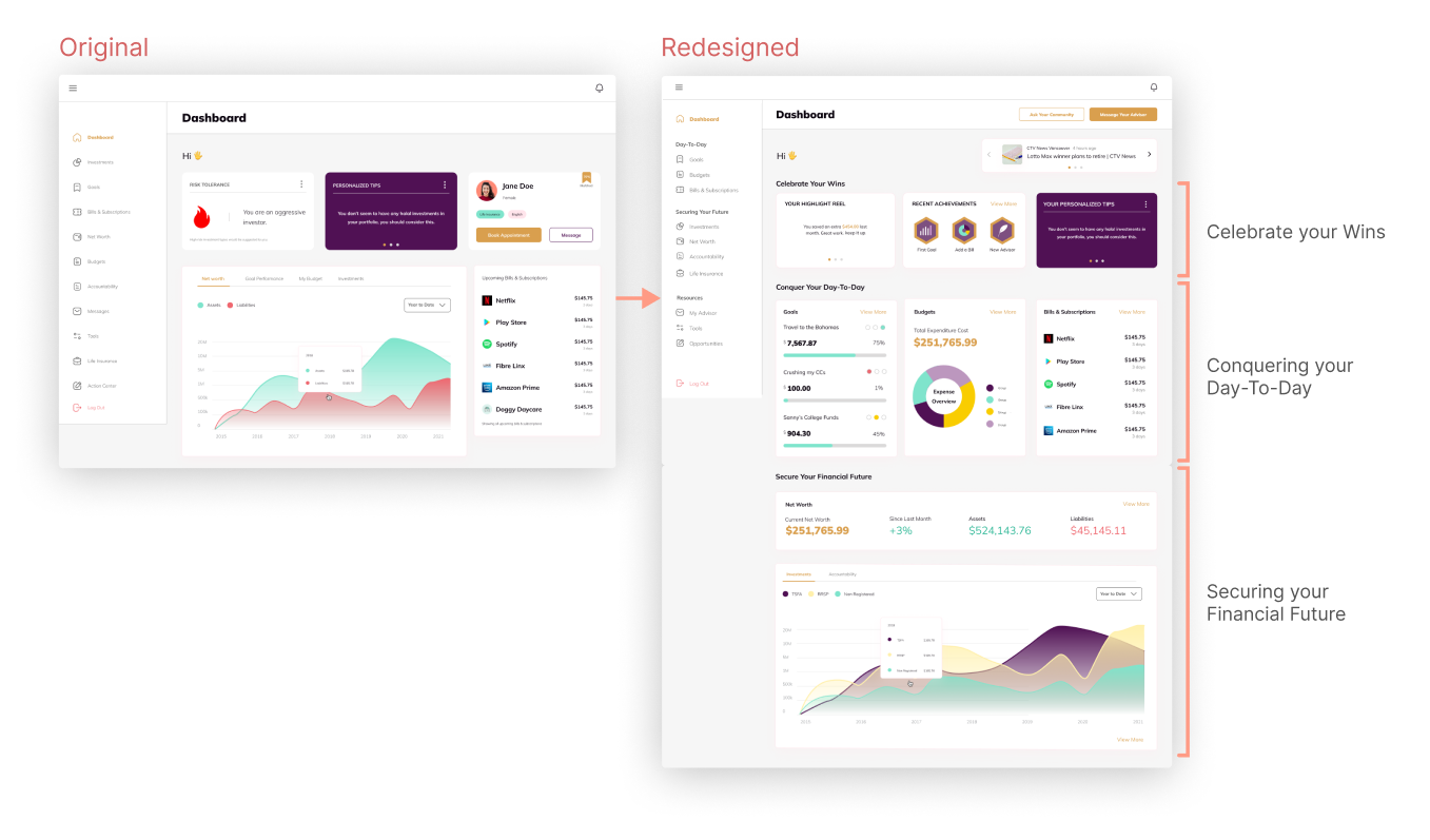
The Redesigned Dashboard and Navigation
The final Dashboard is organized into three main segments. It begins with a “Celebrate Your Wins” section, which provides users with motivational content like recent Achievements and Personalized Tips. Following this, the main subgroups identified from the research are shown. First, the “Conquer your Day-to-Day” section shows summaries of the Goals, Budgets, and Bills features.
As users scroll below the fold, they find the “Secure your Financial Future” section which shows an at-a-glance overview of their Net Worth and Investments. Finally, "Professional Resources" was designed as a persistent button on the top-right of the screen, ensuring that users always have access to assistance wherever they are on the app.
The Navigation has also been reorganized under the three subheadings "Day-to-Day, "Secure Your Future", and "Resources", helping users mentally group the features together into more digestible categories.
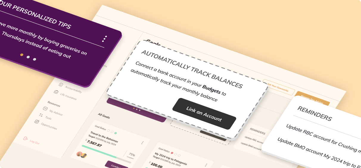
UI Detail: Ghosted Design for the Value Cards
To help emphasize to users that they are missing out on potential value from the platform, a ghost card style was used for the Value Card UI. After a user connects their account, the ghost style would be removed, indicating to the user that they have unlocked the feature.
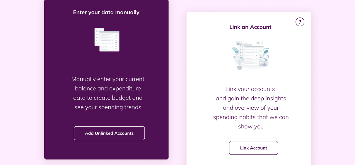
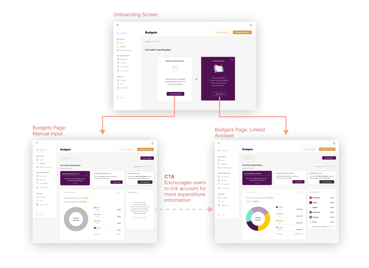
Manual entry onboarding screen for users who don’t want to connect their bank account
Finally, with the new designs encouraging users to connect their bank accounts to access additional features, it was essential for us to account for the possibility that users may not want to connect immediately.
Our team designed a manual budget entry onboarding page for the Budgets feature to allow for users to use the platform even if they don’t feel comfortable connecting a bank account.
In line with the Value Card design, users that choose to manually input their data are shown the additional value that they can gain by connecting their accounts. These encourage them to link for more benefits after becoming more comfortable with the platform.
The density of CTAs at the top of the feature pages could lead to confusion.
The final Dashboard is organized into three main segments. It begins with a “Celebrate Your Wins” section, which provides users with motivational content like recent Achievements and Personalized Tips. Following this, the main subgroups identified from the research are shown. First, the “Conquer your Day-to-Day” section shows summaries of the Goals, Budgets, and Bills features.
As users scroll below the fold, they find the “Secure your Financial Future” section which shows an at-a-glance overview of their Net Worth and Investments. Finally, "Professional Resources" was designed as a persistent button on the top-right of the screen, ensuring that users always have access to assistance wherever they are on the app.
The Navigation has also been reorganized under the three subheadings "Day-to-Day, "Secure Your Future", and "Resources", helping users mentally group the features together into more digestible categories.
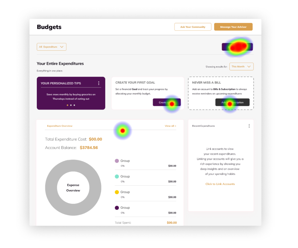
While the scope and timeline of the project did not allow for further revisions based on the usability findings, the insights were provided to our client as recommendations to be applied moving forward. For instance, variations on the Button Labels, visual treatment, and positioning of these CTAs could be further explored to reduce user confusion in this area and improve the usability of the new design.